7dish · Quebec startup
Redesigning 3 Core Tasks for 7Dish’s Meal Planning App
- Role
- UX/UI Designer
- Duration
- 12 weeks
- Team
- 7-person startup, Quebec
- Tools
 Figma
Figma
Background & Project Goals
A native mobile app opened the door to tackling design debt.
Considering the majority of its user base access 7dish on mobile, 7dish hired me to introduce a native mobile app for meal planning. This initiative opened the door to tackling the existing design debt while addressing usability challenges in the previous design.
7dish users struggled when performing core tasks, often stemming from feeling confused or having a sense of getting lost throughout their journeys. I was hired to determine the root causes behind users’ struggles and to redesign 3 core user tasks:
- 01Creating a meal plan
- 02Saving a recipe
- 03Creating a shopping list
Process & Usability Audit
I started by auditing and pinpointing existing usability issues, giving a strong foundation to my design decisions.
The audit revealed consistent patterns across the experience: wasted screen real estate, unclear instructions, non-compliant contrast, inconsistent button states, and navigation that hindered smooth task completion.
Fig. 01 — Design audit across the experience: wasted screen real estate, unclear instructions, contrast failures, inconsistency, and navigation issues.
Homepage Audit (Before)
- ▸Unnecessary use of space: Elements took up too much premium screen real estate.
- ▸Unclear instructions & misleading descriptions: Long, dense copy made it difficult for users to scan and figure out where to start.
- ▸Non-compliant contrast: Text and visual treatments did not meet contrast standards.
- ▸Lack of consistency: Most buttons used the same color regardless of their active/inactive state.
- ▸Ineffective navigation: Blocked buttons and long, unclear copy hindered smooth task completion.
Homepage Solutions (After)
- ▸Short instructions: Clear copy with prioritized, top-of-page placement to save screen real estate.
- ▸New food cards: Food titles separated from images to ensure AAA compliant contrast.
- ▸New home button: Added clear active-state indicators to all navigation icons.
Fig. 01b — Seeing the existing experience through users’ eyes revealed the patterns that needed to change.
Fig. 01c — End-to-end user flow across the three core tasks, mapped during the audit phase.
Redesigning Core Task #1
Create a Meal Plan
The problem
Creating a meal plan was laborious and adding recipes lacked order.
Our initial design audit highlighted that the existing flow was fragmented and unintuitive. To fix this, I introduced:
- ▸Organized daily meal planning hierarchy.
- ▸Meal type selection (Breakfast, Lunch, Snack, Dinner).
- ▸A straightforward approach to adding meals directly from saved folders.
Concept A/B Testing
Two concepts went head-to-head. Flexibility lost.
Concept A (More Flexible)
Day-by-day planning with specific prep and cook times, offering a granular, time-focused design. Result: The majority of users were confused by multiple selections, and large food cards felt visually “overwhelming.”
Concept B (More Controlled) — Winning Concept
Single-day selection featuring a horizontal scroll combined with smaller images. It also included an accessible, minimizable “Unscheduled” tab for quick drafts. This won definitively. Users highly valued quick choice elements (dropdowns/horizontal scrolls) and a high-level daily view.
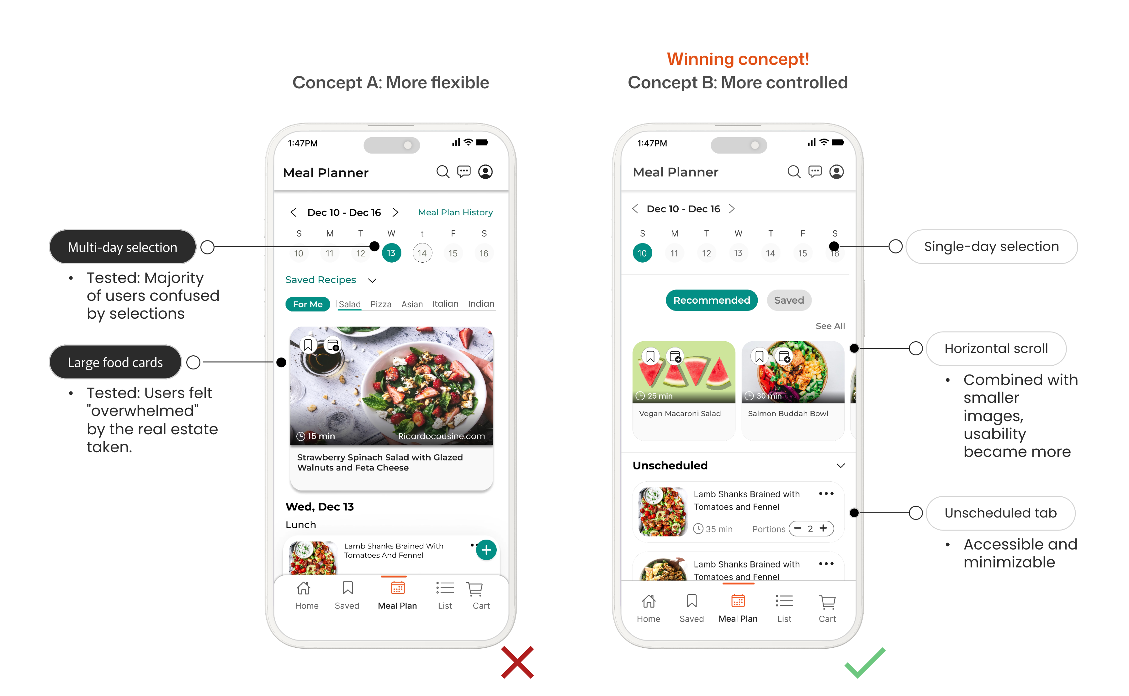
Fig. 02 — Concept A (left) vs. Concept B (right). Users valued quick choices over granular control.
Redesigning Core Task #2
Saving a Recipe
The problem
Users consistently browse and save recipes, but the original flow lacked a clear connection between ‘Saved’ and ‘Meal Planner.’
Users also worried about managing a rapidly growing, unorganized list. The disconnect between screens meant saved recipes felt like a dead end rather than a tool for planning.
The streamlined ‘Saved’ solutions
- ▸Dedicated search bar built directly into the ‘Saved’ screen.
- ▸Sorting and filtering controls.
- ▸Smaller, consistent food cards to eliminate visually overwhelming vertical scrolling.
- ▸Saved Folders feature: Implemented fixed system folders (e.g., ‘Meals Made’, ‘My Recipes’) alongside customizable user folders (e.g., ‘Christmas 2024’, ‘Halloween Recipes’). This gave users the flexibility to pre-plan future events without committing them to their active weekly schedule.
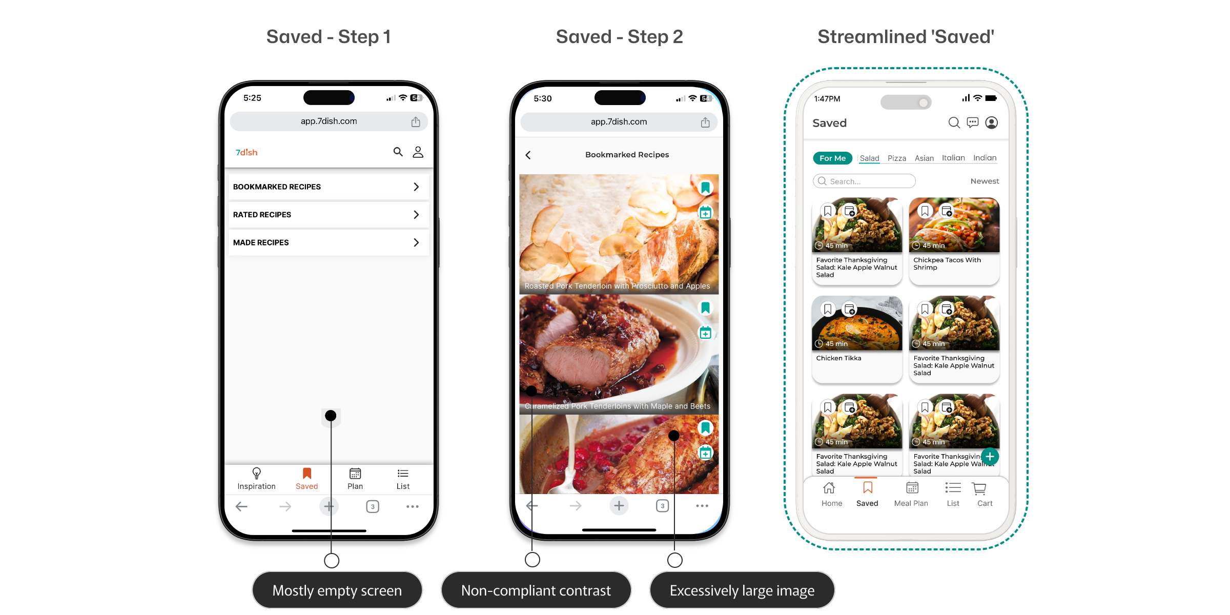
Fig. 03 — Saved Recipes screens with the new folder system, search bar, and consistent food cards.
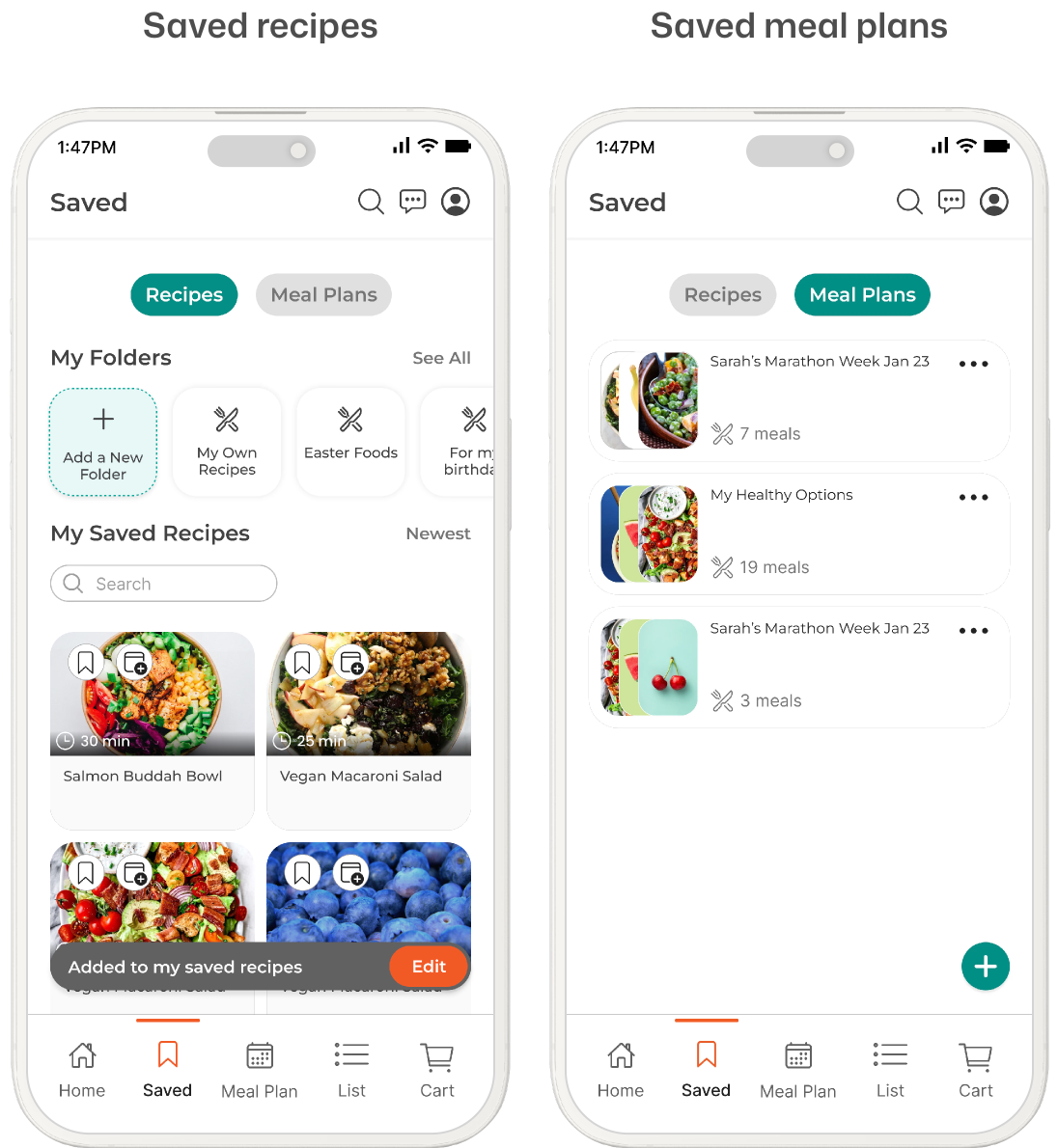
Fig. 04 — Saved Folders feature detail. Fixed system folders + customizable user folders.
Redesigning Core Task #3
Making a Shopping List
The problem
Three glaring usability flaws in the original shopping list.
A shopping list is the final fundamental step of the meal planning journey. The original design had three issues that made this step frustrating:
- 01Absence of an option to delete one item at a time (deleting cleared the entire category).
- 02Use of free-form type-in bars instead of predictive dropdowns led to frequent misspellings and miscalculations.
- 03Unclear iconography (Users noted: “I don’t understand what ‘+ usuals’ means”).
The redesign elements
- ▸Easy editing/deletion of individual line items.
- ▸Predetermined categories attached to items for automated, efficient sorting.
- ▸Clear separation of checked vs. unchecked items: While the initial concept kept them on one screen, 4/5 users explicitly preferred a dedicated separation to track purchases cleanly. I added distinct color-coded separators to streamline the shopping experience.
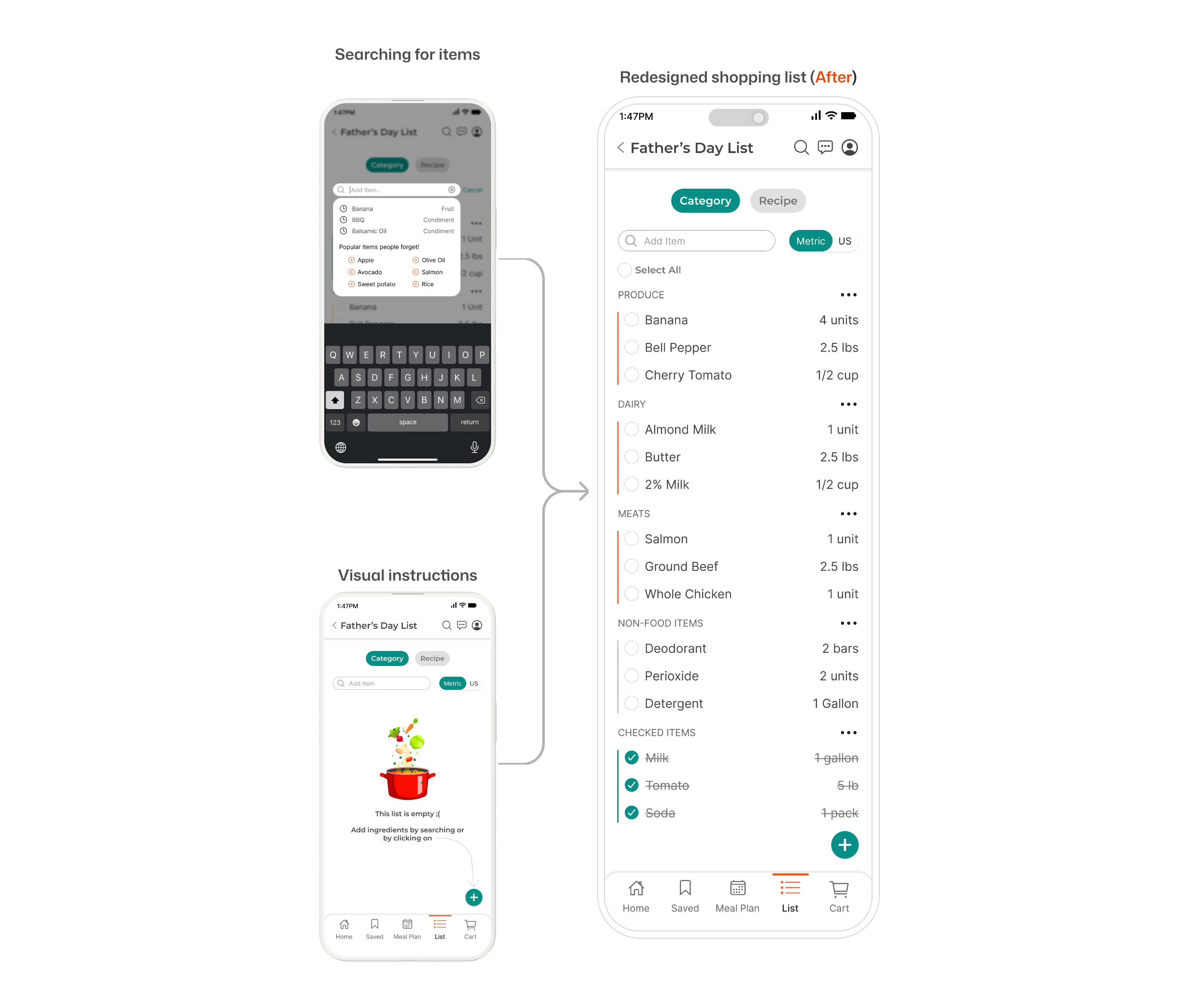
Fig. 05 — Shopping list testing and iteration. 4/5 users preferred separating checked from unchecked items.
Team Collaboration & Stakeholder Alignment
Major UX changes often introduce internal controversy.
For this project, the primary points of alignment involved:
Controversial decision
Eliminating the legacy “Inspiration” page
Removed to make room for a direct, intuitive homepage recipe-browsing workflow. Stakeholders were hesitant — the page had existed since launch.
Scope expansion
Adding the “Saved Recipes Folders” feature
Added technical scope but drastically improved user organization. Not in the original brief — had to be justified with evidence.
Fig. 06a — Design collaboration session with the 7dish team. Aligning stakeholders with evidence, not taste.
Final Testing & Expected Impact
Testing all three redesigned core tasks together revealed a vastly improved end-to-end ecosystem.
When flows that were previously disconnected finally worked together, users noticed immediately. The results confirmed the direction.
Final Metrics
- 01
10/10 of users rated the new app design an 8 or above across Functionality, User-Friendliness, and Aesthetics.
- 02
8/10 users gave positive feedback pointing to higher overall satisfaction and word-of-mouth recommendations.
- 03
Custom search metrics and toggle states give users complete ownership over their dashboards.
- 04
Eliminating shopping list configuration obstacles ensures users transition from digital planning to real-world execution.
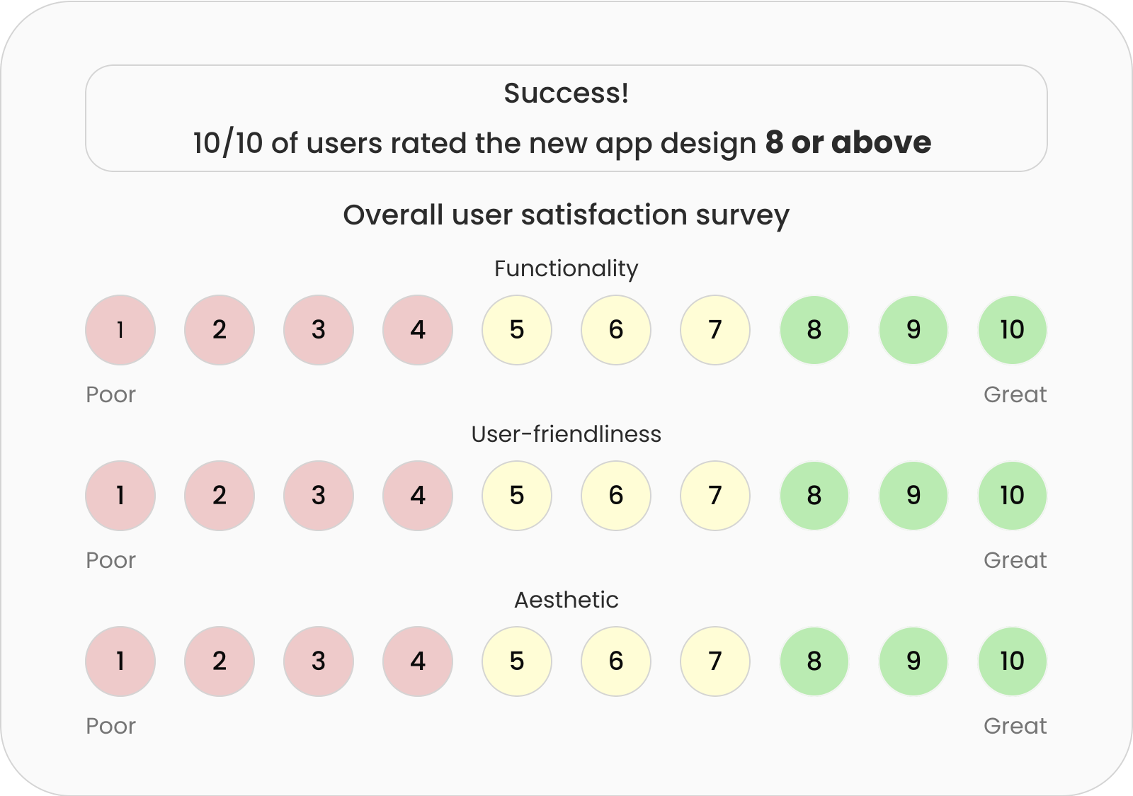
Fig. 06 — Final user testing survey results. 10/10 users rated the new design 8 or above.
“I love how I can now personalize more than I was able to before.”
“This new one feels so fresh, and I can't wait for it to be out.”
Projected Business & User Impact
- ▸Organic Growth: Positive feedback from 8/10 users points to higher overall satisfaction, driving word-of-mouth app recommendations.
- ▸Personalization: Custom search metrics and toggle states give users complete ownership over their dashboards.
- ▸Frictionless Utility: Eliminating the shopping list configuration obstacles ensures users successfully transition from digital planning to real-world execution.